Microsite Landing Page

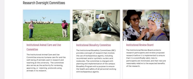
A microsite landing page is the homepage for sections within the parent website (The Office of Research and Innovation / www.research.vt.edu). An example is the Institutional Animal Care and Use Committee, with its landing page featured below:
Microsite landing pages include the following format:
- Header Image of active research
- Introductory paragraph describing the website / topic (or boilerplate description of unit)
- Research Administration News box (if applicable, i.e., there are regular occurring updates that users need to have brought to their attention)
- Automated feeds (if applicable). Example - Events feed
- Highlighted content/initiatives box(es)
- Right column content will be present if there are child pages of the site to be linked, or a single unit contact to be displayed
Main Content Column Elements
The large header image will be consistent for all homepages. Images should show active research, while keeping diversity of researchers in mind. Refrain from graphics full of text as this can create accessibility issues.
The Research Communications team will be working to have a Google Drive Folder of images that editors can look through.
Images can also be pooled from the CMS or if one has access - the Virginia Tech University Relations photo library.
Keep in mind any restrictions (copyright) or bad representation that an image may provide.
An example of bad representation would be an image showing research in a lab, where the person conducting research is lacking the proper safety equipment being worn.

This will be to describe to the user what the website / topic is about. Normally you will want to keep this fairly short (no more than 2-4 sentences). This will be formatted with a Heading 2 <h2> tag. There can be a supplemental paragraph following this paragraph which can use the <p> tag.

This component will pull news updates from the Research Support > Research Administration News section that are tagged for a specific website/topic.
Example stories include:
- Updates from National Science Foundation or National Institutes of Health
- New training requirements
- New tools that are launched
- Announcing a new training or professional development event
This component will pull events from the main Research and Innovation Events section that are tagged for a specific website/topic.
Example events include:
- Research Development Series
- Scholarly Integrity and Research Compliance Investigator Series
- Research Integrity and Scholarly Excellence Lecture Series

This content area will be used to bring attention to important initiatives or information. Examples include:
- Commonly used numbers or IDs
- Program/department links
- Special initiatives the unit is involved in (hosting weekly office hours, etc.)
- Expertise / Service Offerings
This may be designed out in a highlight box, multicolumn card layout, or a simple photo and paragraph setup, depending on the content being presented.


Right Column Usage
Navigation will only be shown if child pages for the page being viewed exist. Otherwise, pages will have a single content column, no header, and no right-rail menu.
Call-to-action buttons are currently used to produce the child navigation links. Each button will have the following styles applied in the call-to-action properties:
- Color Choice: Dark
- Link Style: Outline
- Advanced Options: Text Uppercase
- Advanced Options: Full-Width
*note - with the navigation call-to-actions, the link style will be shown as white with a black outline, whereas call-to-actions used in content will use the “Filled” link style which will present a black background with white text.
Example below of how right column should look:

No more than six child links are recommended in this right-rail as to not have the rail scrolling longer than the main content pane (however this can be a case by case decision from the communications team if more links are needed).
This will follow directly under the last navigation link in the right column. A contact such as this will only be placed if there is one direct contact for the unit / section. Format will be as follows, all left-aligned:
- Image
- Name of person in paragraph <p> format.
- Job Title in paragraph <p> format.
- Phone Number (xxx-xxx-xxxx) in paragraph <p> format.
- Email Address in paragraph <p> format.
Please note - each item in the person’s contact will be in one paragraph tag, wich each new item using a <br> break to go onto the next line directly underneath. Example below:
First Name Last Name
Job Title
540-231-5555
email@vt.edu
Screenshot Example:


