

Call to Action- Links
Call-to-action button in content
Call-to-action buttons are used outside of in-text links to draw greater attention to an action that a website wants a user to perform. Each button will have the following styles:
- Color Choice: Dark
- Link Style: Filled
- Advanced Options: Text Uppercase

In the above example from the Research and Innovation homepage, the “View More Measures >>>” call-to-action button is placed to encourage users to click-through to the linked Facts and Figures page.
Additional settings such as alignment will be dependent on placement of the call-to-action button.
| Alignment | Usage |
|---|---|
| Left | Rarely used, but can be used in a muti-column setup where spacing is an issue with following columns. |
| Right | If in a highlight box and following a teaser paragraph. |
| Center | If following a paragraph of content in the main content pane that isn’t housed in a highlight box. |
Right-rail usage for child links
Call-to-action buttons are currently used to produce the child navigation links. Each button will have the following styles:
- Dark
- Outline
- Text Uppercase
- Full-Width
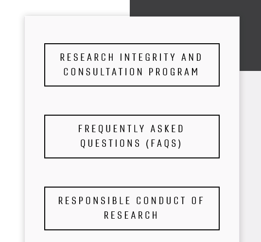
In the above example from the Research Integrity Officer website, there are three child links laid out in the right-rail navigation.
Stacked call-to-actions
In some instances you may want to have direct call-to-actions placed together.

In the above example from the Research and Innovation homepage, a stack of call-to-actions are presented to showcase various research support resources.