

Create an Event Page: How-To
Navigate to https://author.ensemble.vt.edu and login if required.
Click "My Sites".

Scroll down and click "research.vt.edu (Research and Innovation at Virginia Tech)".

Click "Research and Innovation at Virginia Tech" to go to the website root folder.

Scroll down and left click "Events".

Click the respective year for the event. In this example, "2023 Events" will be the year chosen.

You will now begin the page creation process. Click "Create".

Click "Page".

Click on "General Page" to use the general page template.

Click "Next".

In the "Title" field, put the name of the event. DO NOT FILL OUT THE "NAME" FIELD. This will be auto-generated based on the value of the "Title" field.

Example below - the "Title" field has been filled out.

Click into the "Tags" field and begin searching for tags. Start with "Event" to see all of the tags associated with the event tag set, such as hosts, types of event, etc.

One you see the tag you wish to use, left click the tag from the auto-suggest list. You can add multiple tags repeating this process.

Example below: multiple tags have been applied. After selecting tags, move to the "Page Style" section and click on the "Has Right Column" dropdown.

Click "Without Right Column".

Click the "Hide in Navigation" field.

Scroll down to the "Description" field.

In the Description field, you will put in the date and time information for the event. Example - "Sept. 26 | 12:30 - 1:30 p.m."
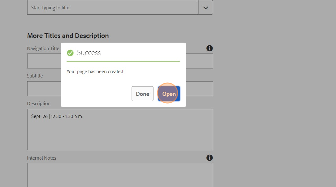
Click "Create".

A success notification will popup. To continue building the page, click "Open".
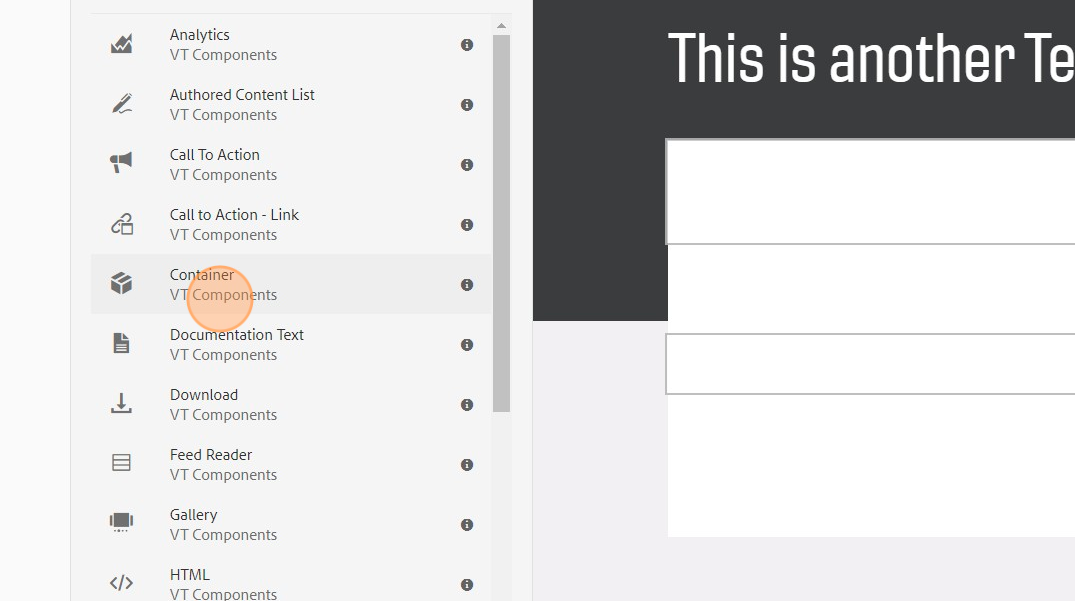
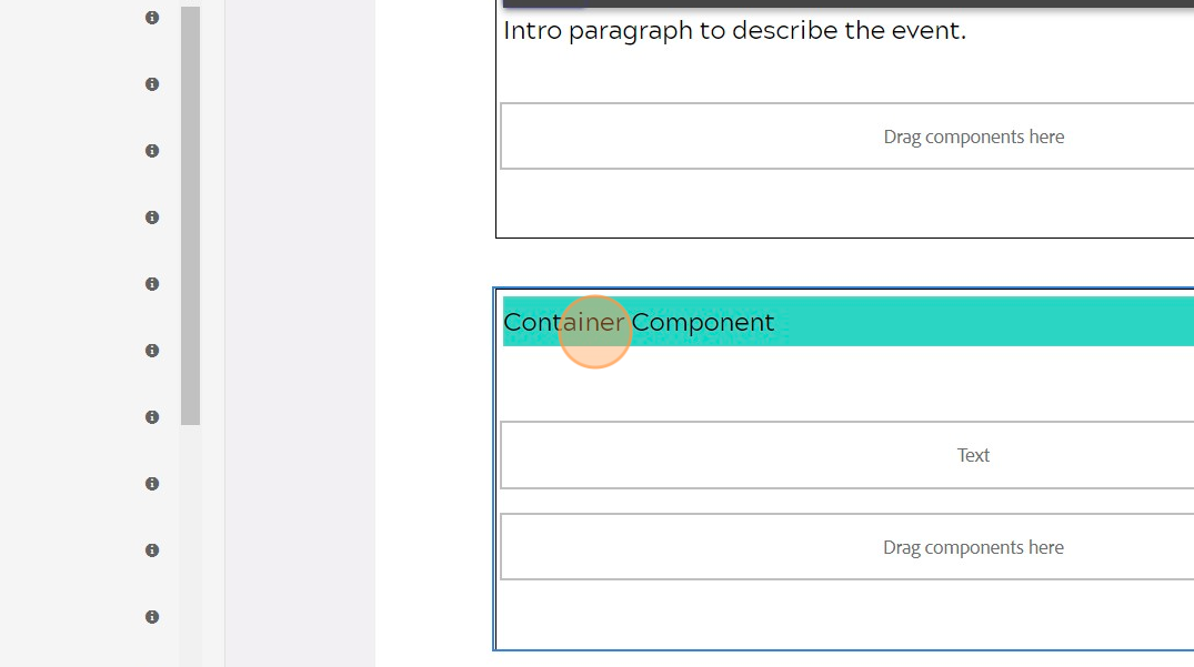
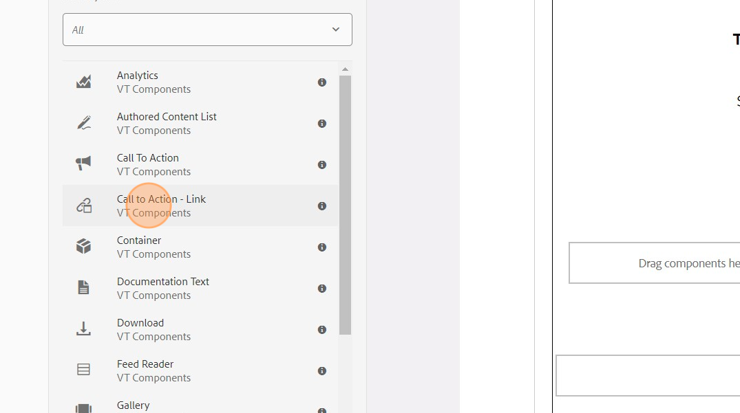
If the left editing panel is not open, click "Toggle Side Panel" from the upper left of the screen. With the side panel open, click the "VT Components" from the upper-left of the side panel to see a listing of components to be used on the page.
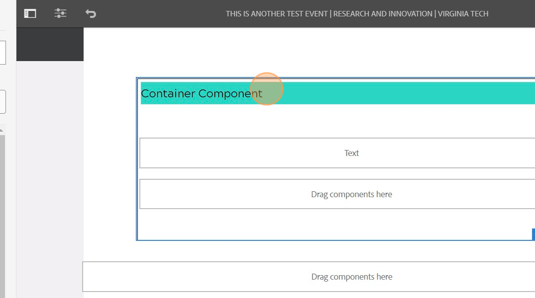
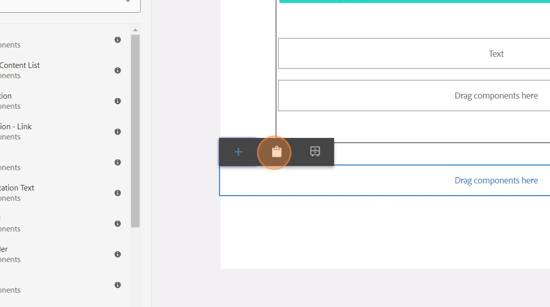
Drag over a container component and then drag a text component into the container.

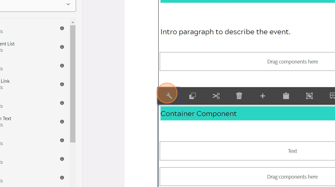
Left click on the container component to reveal options.
Click "copy".

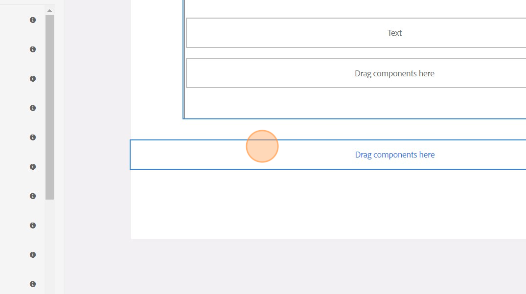
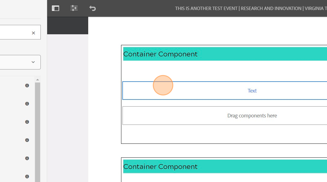
You can now duplicate this container by left clicking the "Drag components here" area and choosing the paste option. Repeat the paste process to add more. There are four containers of content typically used for an event page- the event description, event time, location and registration details, speaker information, and the about event series paragraph.
Example - the paste icon.
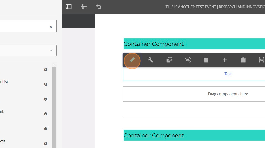
It is now time to input the page content. Scroll to the top of the page.
Left click the top container's text component and click "Edit" (the pencil icon).
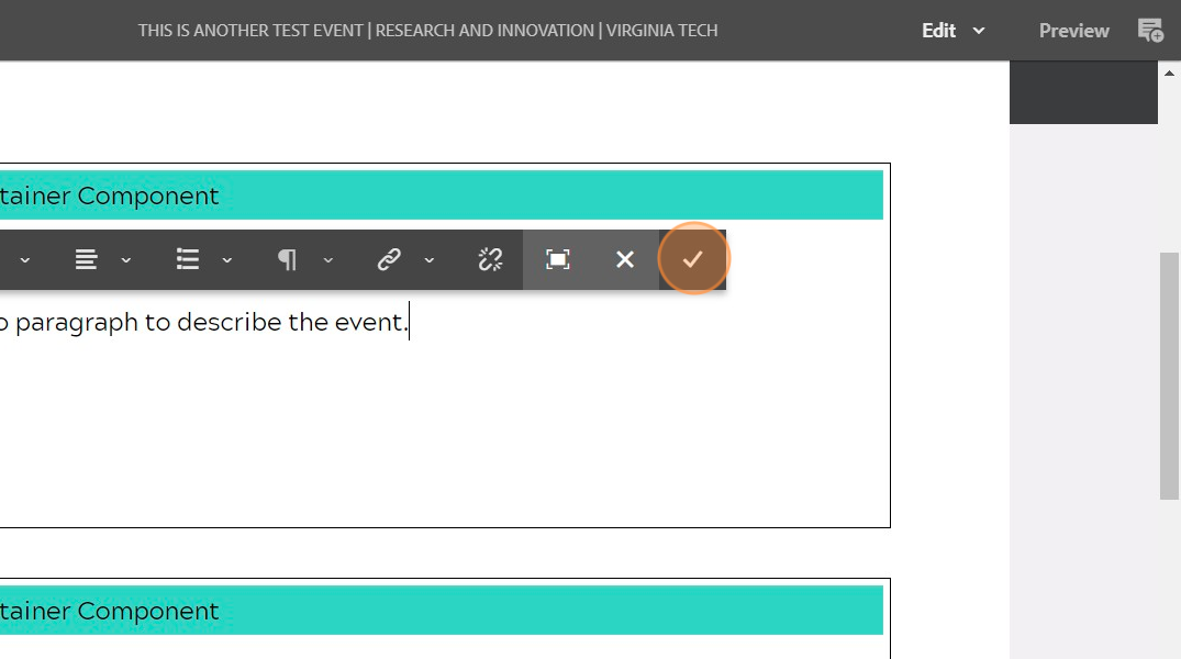
Type out the description of the event.
Click the "checkmark" to accept the text edit.
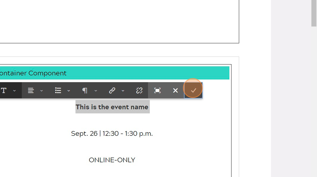
Scroll to the second container. This area will include the Event Information such as Name of Event, Location, Date of Event, Type of Event (ONLINE-ONLY, In-Person address, both) and registration link.
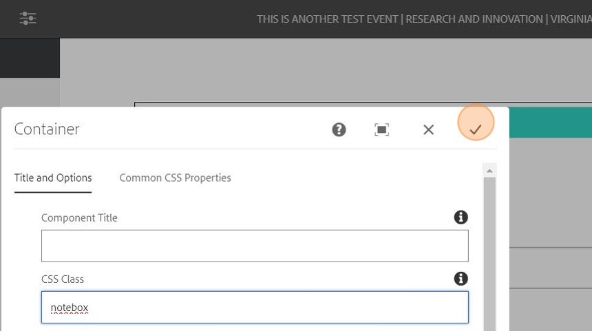
For this container, we will apply a style to add a gray outline around the container. Left click the container and choose the "wrench" icon.
In the CSS Class field, type "notebox".

Click the "checkmark" to accept the changes.
Left click the text component, click the edit icon (pencil) and begin adding in the required information.

Click the checkmark once complete with the text information. The next step will be adding call-to-action button(s) for specific registration types.
Alert: Alert! For the registration buttons, designs will be dependent on the amount of options. There can be a single option (such as if ONLINE-ONLY, or In-Person Only) or multiple options (Both ONLINE-ONLY and In-Person options). If more than one option, a multi-column component will be dragged in below the text component in the container. In each column a "Call-to-Action Link" component will be dragged in. The styling for the Call-to-Action Link buttons are Dark, Filled, Text-Uppercase, Center. If there are more than 2 and are inside a column of a multi-column, you would also choose "Full Width" in the styling options for the Call-to-Action Link button.
Click "VT Components" and drag over a "Call to Action - Link" component.
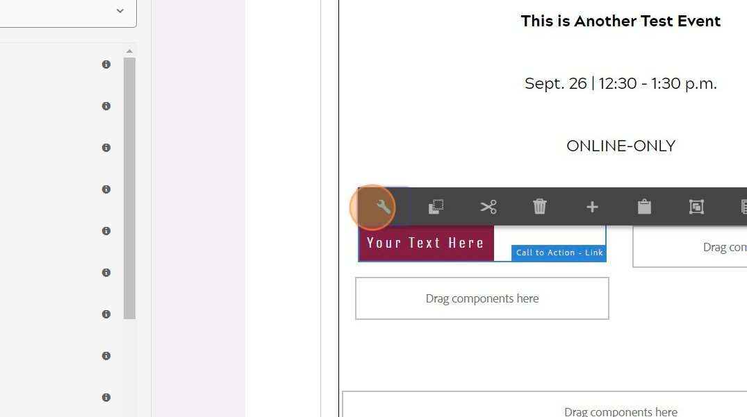
Left click the component to get to its options.
Click the "wrench" icon for configuration options.
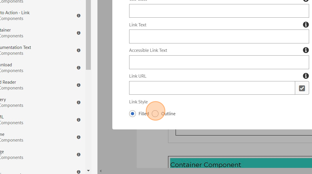
Choose the "Filled" option for the link style.
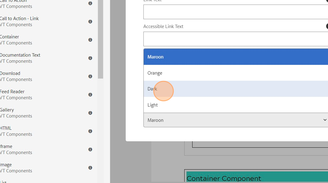
Click the "Color choices" dropdown.
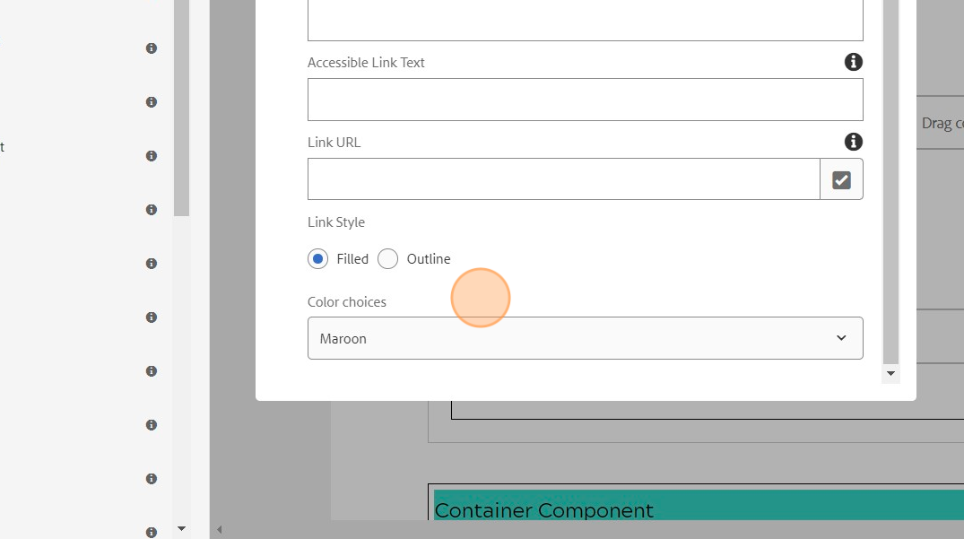
Click "Dark" from the listed options.
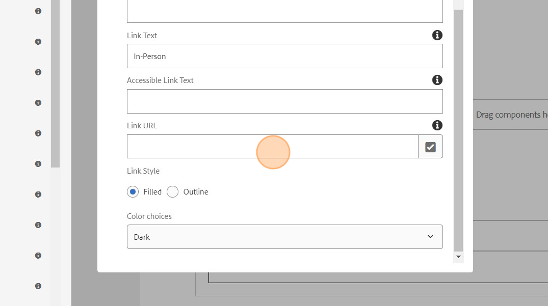
The Link Text will be the text a user sees on the button. Use a verb to be descriptive of the action. Example - "Register for In-Person".

The Link URL field will be where you put the link that the button should take the user to.
Click "Advanced Options".
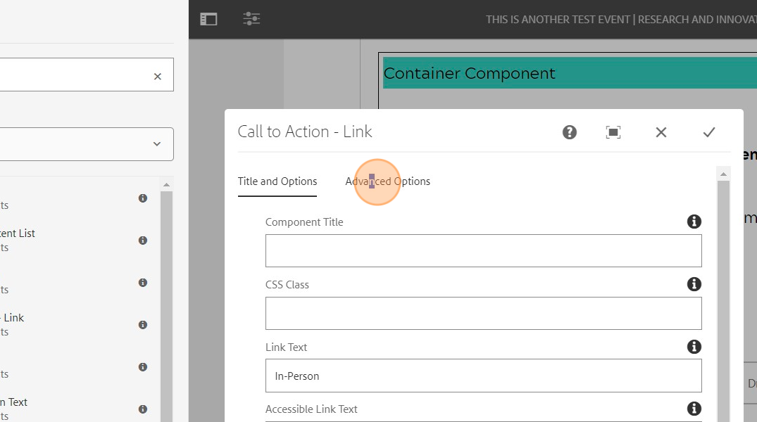
Click the "Alignment" dropdown and choose "Center".

Click the "Text Uppercase" field to check it off.

If the Call-to-Action Link button is within a multi-column component column, click the "Full Width" field to check it off. Else, leave this option blank.

Click the "checkmark" to accept the changes.

If you have more than one button needed, you can left click on the component you just created and copy it. You can then paste it into the next column and edit the properties to their desired setting (should just be the Link Text and Link URL fields).

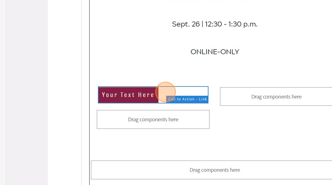
Example below: Finished Call-to-Action Link Buttons for registration options.

Note: If only one Call-to-Action button is required, you would drag this component directly below the text component. It would not have the "Full Width" option selected.
The next step will be moving to the third container to add speaker information. You will:
- drag over a text component and add the text "Speaker" or "Speakers" depending on the amount of speakers.
- You will then drag over a container component and then drag a multi-column component into the container. The left column will then have an image component for the speaker portrait, and a text component for the speaker name and job title. The right column will have a text component for the speaker bio.
Example is shown below. Repeat the container component with the multi-column component for each speaker.

Once speakers are complete, you will go down to the final container you pasted earlier. In this container you will input the "About This Series" information. The "About This Series" text will be a Heading 2 styling. The following supplemental text paragraph will be a paragraph styling. Once finished, click the check mark to accept changes for the text component and then click preview to preview the finished event page.
